You designed a beautiful mailer box. But a tiny file error can delay production and cost you thousands. Let's fix these common mistakes before they happen.
The most common mailer box print file mistakes are using the wrong color mode1 (RGB instead of CMYK), providing low-resolution images%%%FOOTNOTE_REF2%%%, [missing bleed](https://en.wikipedia.org/wiki/Bleed(printing))3, and ignoring the dieline structure%%%FOOTNOTE_REF4%%%. These technical errors are the primary cause of [production delays](https://en.wikipedia.org/wiki/Preflight(printing))5 and poor print quality.

I've seen it all from a supply chain perspective. The most successful brands don't just focus on a great design. They understand how that design translates into a physical product. Small technical details in your print file can cause major delays and add unexpected costs if you ignore them. Let's break down each mistake so you can avoid them completely.
Why Does Print File Setup Matter More Than You Think?
Your design looks perfect on screen. But will it print correctly? Small file errors can ruin your entire batch, wasting time and money. Let's ensure your design translates perfectly.
Proper print file setup%%%FOOTNOTE_REF6%%% is crucial because it's the direct instruction for manufacturing machines. Errors in setup lead to [production delays](https://en.wikipedia.org/wiki/Preflight(printing))5, unexpected costs, and poor quality. It bridges the gap between digital design and the physical product, ensuring what you designed is what you get.

Your print file is more than just a design asset; it's a technical blueprint. The printing and cutting machines don't see beautiful artwork. They see data, lines, and color information. If that data is wrong, the machine produces a flawed product. From my experience, a brand that provides a clean, accurate file gets its product faster and with fewer issues. They understand that design must meet real-world execution. A small investment of time in preparing the file correctly pays off by preventing huge headaches later.
Here’s a simple comparison:
| File Quality | Production Outcome |
|---|---|
| Good File | Smooth process, fast turnaround, high-quality result, no extra costs. |
| Bad File | Production holds, email back-and-forth, delays, poor quality, potential redesign fees. |
Are You Ignoring the Dieline Structure?
You placed your logo perfectly in the center. But what if that's a fold line? Ignoring the dieline can lead to critical design elements being cut off or creased.
The dieline is the template for cutting and creasing your box. Ignoring it means your graphics might not align with the box's physical structure. Key information could land on a fold or be cut off entirely, ruining the final unboxing experience for your customer.

The dieline is the single most important part of your print file's foundation. It tells the machine exactly where to act. I once saw a project delayed by two weeks because the brand's main tagline was placed directly over a major crease line. When the box was folded, the text became distorted and unreadable. They had to redesign and resubmit, which cost them time and money. Always treat the dieline as your guide.
Key Dieline Components
- Cut Lines: These are solid lines, usually magenta, that show where the machine will physically cut the material. Your artwork's bleed should extend past these lines.
- Crease/Fold Lines: These are dashed lines, often cyan, that show where the box will be folded. Avoid placing small text or critical logos directly on these lines.
- Glue/Tuck Tabs: These are the panels that hold the box together. They are often hidden when the box is assembled, so don't place any important design elements here.
Is Your File Missing Correct Bleed Settings?
Your background color stops exactly at the edge of your design. But printing machines aren't perfect. A tiny shift can leave an ugly white border on your finished box.
Bleed is extra artwork that extends beyond the box's final trim edge. It's essential because it prevents unprinted white lines from appearing if the cutting machine shifts slightly. Without bleed, you risk a sloppy, unprofessional finish on your packaging. Most printers require 3-5mm of bleed.

Think of bleed as an insurance policy for your design. Die-cutting machines are very precise, but when cutting thousands of boxes, a tiny shift of a millimeter is possible. If your color stops exactly at the cut line, that tiny shift will expose the unprinted white paper underneath. It instantly makes a premium product look cheap. I always tell my clients to extend all background colors and images at least 3mm past the cut line on all sides. This ensures that even with a slight machine variance, the color will go perfectly to the edge of the finished box every single time.
| Scenario | With Proper Bleed | Without Bleed |
|---|---|---|
| Machine Cut is Perfect | Looks great, color goes to the edge. | Looks great. |
| Machine Shifts 1mm | Looks great, color still goes to the edge. | An ugly white line appears. |
Are You Using RGB Instead of CMYK?
The colors on your screen are vibrant and beautiful. But when printed, they look dull and muddy. The problem is likely your color mode1. Let's fix this common issue.
Use CMYK (Cyan, Magenta, Yellow, Key/Black) for print files, not RGB (Red, Green, Blue). RGB is for digital screens and has a wider color range. Printing in RGB forces a conversion to CMYK, which can cause unexpected, dull, and inaccurate color shifts.

This is one of the most frequent issues I see. A client will fall in love with a bright, electric blue on their screen, only to be disappointed when the printed box shows a muted navy blue. This happens because screens create color by adding light (RGB), while printers create color by subtracting light with ink on paper (CMYK). The range of colors available in RGB is much larger. When you send an RGB file to print, the printer's software has to make its best guess to convert the colors to the smaller CMYK range, and the results are often not what you expected. Always start your design in CMYK mode to see a more accurate representation of the final printed colors.
| Feature | RGB (Red, Green, Blue) | CMYK (Cyan, Magenta, Yellow, Black) |
|---|---|---|
| Used For | Digital Screens (Websites, Social Media) | Physical Printing (Boxes, Brochures) |
| Color Model | Additive (light is added to create color) | Subtractive (ink absorbs light) |
| Result of Mismatch | Bright screen colors can become dull in print. | N/A |
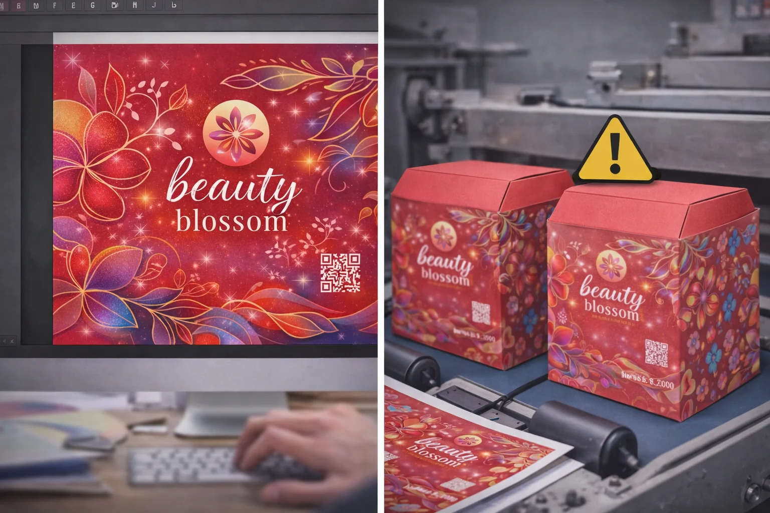
Are Your Images Low Resolution?
Your logo looks sharp on your monitor. But on the printed box, it's blurry and pixelated. This cheapens your brand's look. The cause is almost always low resolution.
For high-quality printing, all images and raster graphics must be at least 300 DPI7 (dots per inch) at their final print size. Anything lower will appear blurry or pixelated. Screen resolution (72 DPI) is not sufficient for professional print production.
![]()
Resolution is about density. Think of it as the number of ink dots the printer will place in a one-inch square. A 72 DPI image, which looks fine on a screen, will look fuzzy and unprofessional when printed because the dots are too big and far apart. For a crisp, clear result, you need 300 DPI7. A common mistake is pulling a logo from a website and putting it in a print file. Website images are almost always 72 DPI to load quickly. You must use the original, high-resolution source file for print. You cannot simply increase the DPI of a low-resolution image; this just makes the existing pixels bigger. You have to start with a quality source.
How to Check Your Resolution
- In Adobe Illustrator: Select the image. Check the top control bar or the Links panel for the effective PPI (pixels per inch).
- In Adobe Photoshop: Go to
Image > Image Size. Make sure the "Resolution" field is set to 300 pixels/inch.
Have You Forgotten to Outline Your Fonts?
Your design uses a unique, custom font. You send it to the printer, and they open it. Suddenly, your text is replaced with a default font like Arial.
You must convert all text to outlines (or curves) before sending your file to the printer. This turns the text into a vector shape. If you don't, the printer's computer might substitute the font if they don't have it installed, completely ruining your design.

This is a classic "uh-oh" moment. Your carefully chosen brand font is a file on your computer. If the printer doesn't have that exact font file installed on their computer, their software will automatically replace it with a default one. The entire look and feel of your packaging can be destroyed in an instant. The solution is simple: convert all your text to outlines. In Adobe Illustrator, you just select the text and press Shift+Ctrl+O (or Shift+Cmd+O on Mac). This action turns the letters into shapes, so they will look exactly the same on any computer. My professional tip is to always save two versions: one with live text for your own future edits, and a final "Print-Ready" version with everything outlined.
| Action | Pro | Con |
|---|---|---|
| Keeping Text Live | Easy to edit spelling mistakes. | High risk of font substitution at the printer. |
| Outlining Fonts | Guarantees the text looks exactly as designed. | Text is no longer editable as text. |
Are Your Layers Not Separated Properly?
You send a single, flattened image to your printer. Now they need to add a spot UV finish8, but they can't isolate the logo. This causes delays and extra design fees.
Keep your artwork, dieline, and any special finishes (like spot UV or foil) on separate, clearly labeled layers. This allows the manufacturer to easily isolate each element for production. A messy file with everything on one layer is difficult and time-consuming to work with.

A well-organized file is a sign of a professional. When a prepress team receives a file with everything on separate layers9, they can work quickly and efficiently. They can turn off the artwork layer to check the dieline, or isolate the spot UV layer to create the printing plate for it. If you send a flattened file, the prepress team has to manually try to recreate these separate elements, which adds time and cost to your project. It's a simple step that shows you understand the manufacturing process and respect the production team's time. A clean file gets processed faster, every single time.
Ideal Layer Structure (from top to bottom)
- Spot UV / Foil: Contains only the shapes for the special finish.
- Artwork: All your graphics, text, and colors.
- Dieline: The cut and crease lines10 provided by your supplier.
- Information: Any non-printing notes for the printer.
Are You Ignoring the Safe Zones?
Your website URL is placed right at the edge of the box panel. After production, you notice part of the URL is almost cut off. This looks unprofessional and careless.
The safe zone is an inner margin inside the cut line (dieline). All critical elements like text, logos, and QR codes must stay within this area. This ensures they won't get trimmed off during die-cutting, which can have slight variations from box to box.

Just like bleed protects the outer edges of your design, the safe zone protects the inner content. The cutting process has a small tolerance for error, meaning the cut might happen a fraction of a millimeter inside or outside the line. If your logo or text is right up against that line, it's at risk of being trimmed. This is why printers provide a safe zone. I always recommend keeping all important content at least 3mm to 5mm inside the trim line. This gives plenty of buffer room and guarantees that your message remains intact, no matter what. It's a simple rule that prevents a very amateur-looking mistake.
The Three Key Margins
- Bleed Area: The outermost part. Your background must extend to this edge.
- Trim Line (Dieline): The line where the box will be cut.
- Safe Zone: The innermost area. All your important content must live here.
Is Your Design Overcomplicated for Production?
Your design has thin lines, tiny text, and complex gradients. On screen, it's a masterpiece. But in reality, the printing press11 can't reproduce that level of detail.
Some designs are too complex for certain printing methods12. For example, very fine lines or small text may not print clearly, especially on corrugated cardboard. It's crucial to design with the limitations of the printing press11 and material in mind for a clean result.

This is where design vision meets manufacturing reality. A beautiful, intricate design might be perfect for digital printing on smooth paper, but it could be a disaster for flexographic printing on a corrugated shipping box. The ink can bleed on the rough surface, causing thin lines to disappear and small text to become illegible. The key is to talk to your supplier early in the process. Ask them simple questions like, "What is the minimum line weight your press can handle?" or "What is the smallest font size you recommend for this material?" This conversation aligns your design with the production capabilities, ensuring the final product looks as good in real life as it does on your screen.
| Printing Method | Best For | Struggles With |
|---|---|---|
| Flexographic Printing | Large runs, simple logos, solid color blocks. | Fine details, small text, photographic images. |
| Litho & Digital Printing | High-detail, full-color photos, complex graphics. | Cost-effectiveness on very simple, large-run jobs. |
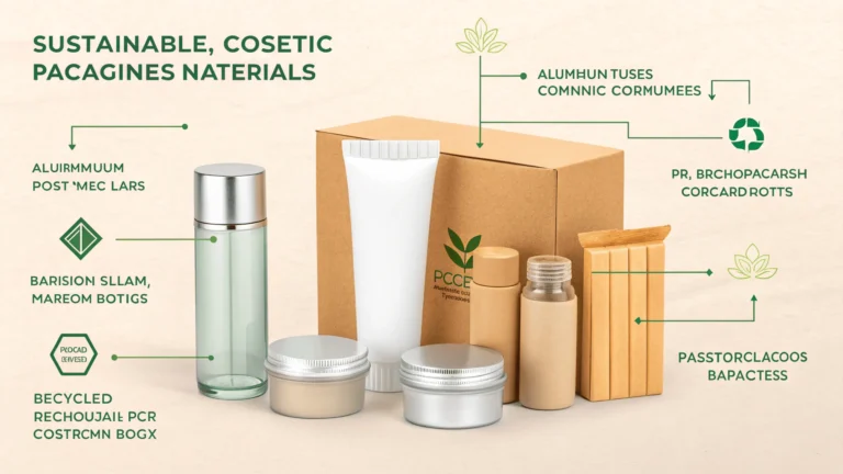
Did You Forget to Consider the Material and Finish?
You chose an uncoated, kraft paper for your box. But your design uses bright, vibrant colors. The final product looks dark and muted because the ink soaked into the paper.
The material and finish13 of your box dramatically affect how colors appear. Uncoated paper absorbs more ink, making colors darker. A gloss finish makes colors pop. You must account for this during the design phase, or your brand colors might look completely wrong.

The substrate—the material you print on—is not a neutral background. It plays an active role in your final colors. Uncoated kraft paper is like a sponge; it soaks up ink, which can make a bright yellow look like a mustard brown. A coated white paper, on the other hand, lets the ink sit on top, resulting in bright, vibrant colors. The same goes for finishes. A matte lamination will soften colors for an elegant look, while a gloss lamination will make them look shiny and saturated. Before you finalize your design, you must know what material you are printing on. My best advice is to always ask your supplier for a printed sample on the exact material and finish you plan to use.
| Material / Finish | Color Appearance | Best For |
|---|---|---|
| Uncoated Kraft | Muted, darker, rustic feel. | Earthy, natural, or eco-conscious brands. |
| Coated Whiteboard | Bright, vibrant, accurate colors. | Brands wanting a premium, clean, and modern look. |
| Gloss Lamination | High contrast, shiny, colors pop. | Eye-catching, retail-ready packaging. |
| Matte Lamination | Soft, muted, elegant look. | Luxury, wellness, or minimalist brands. |
Are You Skipping the Final Pre-Production Check?
You're in a rush, so you send the file to production without a final look. Later, you spot a typo. Now it's printed on 10,000 boxes.
Before submitting, do one last check. Print the dieline flat, review every word for typos, and double-check technical specs like color mode and resolution. This five-minute review can save you from a massive, costly mistake. Get a second pair of eyes to look it over.

This is your last chance to catch an error before it becomes a very expensive problem. I once worked with a company that misspelled its own website URL on its packaging. A simple final check would have caught it. The reprint cost them over $5,000 and delayed their product launch by three weeks. It's easy to become "design blind" when you've been looking at the same file for hours. Print it out, even on a home printer. Read every single word out loud. Have a colleague who has never seen the design look it over for a few minutes. This final step is not about being paranoid; it's about being professional and protecting your investment.
Your Final 5-Minute Check
- Spelling & Grammar: Read everything out loud, backward.
- Technical Specs: Is it CMYK? 300 DPI? Fonts outlined?
- Dieline Alignment: Is everything within the safe zones? Is the bleed correct?
- File Naming: Is the file named clearly (e.g.,
Brand_MailerBox_V4_PrintReady.pdf)?
From a Manufacturer’s Perspective, What Causes Delays?
You submitted your file and are waiting for your boxes. Days turn into weeks. You blame the factory, but the delay might have started with your file.
From a manufacturer's view, the biggest delay is a "bad" print file. When a file has issues, we have to stop, contact the client, explain the problem, and wait for a revised file. This back-and-forth can add weeks to a project timeline.

When a clean, print-ready file arrives, it flies through the prepress department and gets scheduled for production almost immediately. When a file with problems arrives, it hits a wall. The job is put on hold. The prepress team has to document the issues—RGB colors, missing bleed, low-res images—and send an email back to you. Then we wait. You might need to get your designer to make the fixes, which could take a day or two. You send back the new file, and it goes into the prepress queue again. This cycle can repeat. A simple one-week job can easily turn into a three-week job, all because of issues that could have been fixed beforehand. A good file is the fastest way to get your boxes.
The Typical Delay Workflow
- File Received: Prepress team opens the file.
- Problem Found: e.g., RGB colors, missing bleed.
- Production Halted: The job is put on hold.
- Contact Client: An email is sent to explain the technical issue.
- Client Revises: The designer needs to find time to fix the file.
- New File Submitted: The file goes back to the end of the queue.
Do You Have a Simple Checklist Before You Submit Your Print File?
Feeling overwhelmed by all the technical details? Don't be. Keeping a simple checklist by your side can prevent 99% of common print file errors.
Use a checklist to ensure every file is perfect. Key points include: CMYK color mode, 300 DPI resolution, all fonts outlined, 3-5mm bleed included, and all critical art is within the safe zone. This simple process builds a habit of excellence.

Building a habit of using a checklist is the most effective way to guarantee consistency and quality. It takes the guesswork out of the process and ensures you never forget a critical step, especially when you are in a hurry. I've developed this checklist over years of seeing the same mistakes happen again and again. Go through it point by point before you ever attach a file to an email or upload it to a printer's portal. It will save you time, money, and stress. Think of it as your pre-flight check before your design takes off for production.
The Ultimate Print-Ready Checklist
| Check | Item | Done? |
|---|---|---|
| Color | File is in CMYK color mode. | ☐ |
| Resolution | All raster images are 300 DPI at print size. | ☐ |
| Fonts | All text has been converted to outlines. | ☐ |
| Dieline | Artwork is correctly placed on the supplier's dieline. | ☐ |
| Bleed | Artwork extends 3-5mm beyond the cut line on all sides. | ☐ |
| Safe Zone | All text/logos are inside the safe zone (3-5mm in). | ☐ |
| Layers | Dieline, art, and finishes are on separate, named layers. | ☐ |
| Proofread | All text has been checked for typos and errors. | ☐ |
| File Format | Saved as a press-quality PDF or a packaged AI file. | ☐ |
Conclusion
A clean print file is your best insurance against costly delays. Follow these steps, work with your supplier, and get your packaging right the first time.
Understanding color modes is crucial for ensuring your designs print accurately and vibrantly. ↩
Learn why high-resolution images are essential for professional print quality and how to avoid common pitfalls. ↩
Discover how bleed prevents unprinted edges and ensures a polished final product. ↩
Understanding dielines is key to ensuring your design aligns perfectly with the physical product. ↩
Explore the factors that can lead to delays and how to avoid them for a smoother process. ↩
Learn how a well-prepared print file can save time and costs during production. ↩
Understanding DPI is crucial for achieving sharp, high-quality printed images. ↩
Learn about spot UV finishes to enhance your packaging design with a professional touch. ↩
Discover how organized layers can streamline the printing process and reduce errors. ↩
Learn about crease lines to avoid critical design elements being cut off or distorted. ↩
Understanding printing presses can help you choose the right method for your design. ↩
Understanding various printing methods can help you select the best option for your project. ↩
Explore how the choice of material can impact the final appearance of your printed product. ↩