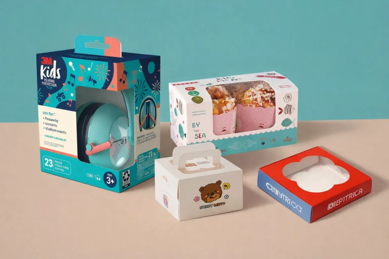
Struggling to create cosmetic packaging1 that looks great and performs perfectly? You're not alone. Bad packaging can fail on shelves, break in transit, or cost a fortune to produce.
To create effective cosmetic packaging1, you must follow a structured process. Start by defining your brand and customer. Then, understand your product's technical needs2, choose the right materials and structure3, design for manufacturability4, and test everything thoroughly before mass production. This ensures a balance between beauty, function, and cost.

This step-by-step guide seems simple on the surface. But I've seen countless brands stumble because they miss crucial details. The real secret is understanding how these steps connect, especially from a manufacturing point of view. Let's dive into the process that I use with my clients, a process that avoids costly mistakes and delivers packaging that actually works in the real world.
Why does effective cosmetic packaging1 matter?
Do you think packaging is just a pretty box for your product? This thinking can cost your brand dearly. Your packaging is your silent salesperson, your first impression, and a promise to your customer.
Effective cosmetic packaging1 is critical because it protects the product, communicates your brand's identity, and directly influences a customer's decision to buy. It is the most tangible interaction a customer has with your brand, making it essential for building trust and standing out on a crowded shelf.

I've worked in this industry for years, and I can tell you that great packaging does more than just hold a product. It tells a story. When a customer picks up your product, the weight of the jar, the click of the cap, and the feel of the finish are all communicating something about your brand's quality and values. It’s your first and sometimes only chance to make a physical connection. From a supply chain perspective5, it also has a critical job: to protect the formula inside from air, light, and contamination, and to survive the journey from the factory to the customer's home without leaking or breaking. A beautiful design that fails at this basic function is a complete failure.
Here’s a breakdown of its impact:
| Aspect | Good Packaging Impact | Bad Packaging Impact |
|---|---|---|
| First Impression | Grabs attention, looks premium, builds trust. | Looks cheap, gets ignored, feels untrustworthy. |
| Brand Story | Clearly communicates values (e.g., natural, luxury). | Confuses the customer, sends mixed signals. |
| Functionality | Easy to use, protects the product effectively. | Leaks, breaks, is hard to open or dispense. |
| Sales | Drives purchase, encourages repeat business. | Sits on the shelf, leads to bad reviews. |
Step 1 – How do you define your brand & target market?
Are you trying to design your packaging in a vacuum? If you don't know who you are and who you're talking to, your packaging will feel generic and connect with no one.
First, you must define your brand's personality (e.g., minimalist, luxurious, clinical, eco-conscious) and your ideal customer. These two elements will guide every single design, material, and color choice you make, ensuring your packaging resonates with the right people and feels authentic to your brand.

This step is the foundation for everything else. I once had a client who wanted a "luxury" product but chose packaging that screamed "budget." They loved a flashy design they saw online, but it had no connection to their brand story6 or their target customer, who was a minimalist professional. We had to go back to the drawing board. We asked: Is your brand playful or serious? Is your customer a Gen Z trend-follower or a 40-year-old looking for proven results? The answers dictate your path. A brand targeting Gen Z on TikTok might use bright colors and bold typography. A brand targeting professionals might choose understated elegance with a heavy glass jar and simple, clean fonts. Skipping this step is like building a house with no blueprint; the result is always a mess.
| Brand Archetype | Target Customer | Potential Packaging Cues |
|---|---|---|
| The Sage | Seeks knowledge, clinical results. | White/blue colors, airless pumps, scientific fonts. |
| The Innocent | Desires purity, natural ingredients. | Kraft paper, glass, green/earthy tones, simple graphics. |
| The Ruler | Craves control, luxury, status. | Heavy glass, gold/silver accents, weighted caps. |
| The Jester | Wants fun, lives in the moment. | Bright colors, playful shapes, bold typography. |
Step 2 – How do you understand product requirements & regulations?
Are you excited to start designing but forgot about the technical details? Your amazing design is useless if the product inside leaks, goes bad, or gets rejected by retailers for not being compliant.
You must understand your product's formula (oil-based, water-based, containing active ingredients), its dispensing needs, and all legal labeling requirements7. This includes the INCI list, net weight, and period-after-opening symbol. This technical brief must be finalized before any creative work begins.

This is the part where so many creative-led brands stumble. From a manufacturing standpoint, this is non-negotiable. Your product's formula dictates the material you can use. For example, certain essential oils can degrade or even melt some types of plastic. An oxygen-sensitive Vitamin C serum needs an airless pump or an opaque bottle to remain stable, not a clear, wide-mouth jar. Then there are the regulations. In the US, the FDA has rules. In the EU, the regulations are even stricter. You need space on your packaging for the ingredient list (INCI), the net weight, your company's address, and often a batch code. I’ve seen beautiful, minimal designs that had to be ruined because the designer didn't leave enough space for this required text. Getting this wrong doesn't just look bad; it can get your product pulled from shelves.
Key Technical Considerations
- Formula Compatibility: Will the ingredients react with the plastic or metal?
- Dispensing: Does it need a pump, dropper, spray, or spatula? How much per use?
- Protection: Does it need protection from UV light or oxygen?
- Labeling: Is there enough space for all legally required information?
- Shipping: Can it withstand changes in pressure and temperature during transit?
Step 3 – How do you choose the right packaging type8 & structure?
Feeling overwhelmed by all the options like jars, tubes, airless pumps, and dropper bottles? Choosing the wrong one can be inconvenient for customers, fail to protect your product, or be impossible to fill.
The right packaging type8 depends on your product's viscosity, sensitivity to air, and the intended user experience9. A thick cream works well in a jar, while a liquid serum needs a dropper or pump. Function and user-friendliness should always come before pure aesthetics.

The structure of your packaging is all about the user experience9 and product preservation. Think about how your customer will use the product. A body lotion in a jar is a pain; a pump bottle is much better. A face oil with a wide-open top is a recipe for spills; a dropper provides control. But there's a manufacturing angle here, too. Some unique bottle shapes look amazing but are very difficult to label or fill on an automated production line. This can dramatically increase your costs or lead times. I always advise clients to balance a unique silhouette with production reality. An airless pump is fantastic for protecting sensitive formulas, but it's more expensive than a standard pump. A simple tube is cost-effective and great for creams and gels. Your choice here is a three-way balance between what's best for the product, best for the customer, and feasible for production.
| Packaging Type | Best For | Pros | Cons |
|---|---|---|---|
| Jar | Thick creams, masks, scrubs | Looks premium, easy to get all product out. | Can be unhygienic, exposes product to air. |
| Airless Pump | Serums, lotions with active ingredients | Hygienic, protects from air/light, precise dose. | More expensive, complex mechanism. |
| Tube | Gels, cleansers, creams | Cost-effective, hygienic, good for travel. | Can be hard to get the last bit out. |
| Dropper Bottle | Face oils, liquid serums | Precise application, looks scientific/luxe. | Can let air in, glass is breakable. |
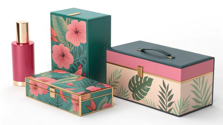
Step 4 – How do you select materials that balance cost & performance?
Do you want that ultra-premium feel but have a very real budget? Choosing the wrong material can make your product feel cheap, or worse, eat up your entire profit margin.
Material selection is a trade-off between perceived value, cost, durability, and sustainability10. Glass feels heavy and luxurious, but PET plastic is lighter and more shatter-resistant. The key is to find the material that fits your brand identity11 and your cost-per-unit target.

This is where your brand identity11 from Step 1 meets your budget. In my experience, this is one of the most important decisions. Glass is often seen as the premium choice. It's heavy, inert, and has a high-end feel. But it's also more expensive to produce and ship, and it can break. Plastics like PET and PP are incredibly versatile, lightweight, and durable, but they can sometimes feel less luxurious unless you choose high-quality options with good finishes. Aluminum gives a modern, clinical, and sustainable feel, but it can dent. I worked with a startup that wanted to use beautiful glass bottles but didn't account for the higher shipping costs. It completely destroyed their margins. We switched to a high-quality, thick-walled PET bottle that still felt substantial but cut their shipping costs in half. The goal isn't to always choose the most expensive material, but the right material for your brand and business model.
| Material | Perceived Value | Unit Cost | Durability | Sustainability |
|---|---|---|---|---|
| Glass | High | High | Breakable, Heavy | Infinitely recyclable. |
| PET Plastic | Medium-High | Low-Medium | Shatter-resistant, Light | Widely recycled (rPET is great). |
| PP Plastic | Low-Medium | Low | Durable, heat resistant | Recyclable, but less common. |
| Aluminum | Medium-High | Medium | Dents easily | Infinitely recyclable, lightweight. |
Step 5 – How does decoration & printing really affect cost?
Do you have a beautiful, multi-colored, full-wrap design ready to go? Be careful. That amazing design might be technically impossible or cost more to print than the component itself.
Decoration methods like screen printing, hot stamping, and labeling have vastly different costs and capabilities. The final cost is driven by the number of colors, the surface area covered, the complexity of the art, and the setup fees for each method. Simpler is often smarter.

This is a classic "design vs. reality" conflict. A designer might create a stunning visual with 12 colors and a metallic gradient that wraps perfectly around a curved bottle. On screen, it looks perfect. In production, it's a nightmare. Each color in screen printing requires a separate pass and a separate screen, adding cost each time. Hot stamping gives you a beautiful metallic finish, but it's best for simple logos, not fine details. A full-color image might require an offset-printed label, which adds another step and cost. My advice is always to talk to your manufacturer while you are designing. Show them your ideas early. A good partner will tell you, "We can achieve a similar premium look with a single-color screen print and a hot-stamped cap, and it will save you 30 cents per unit." This collaboration is key to balancing aesthetics with budget.
| Decoration Type | Best For | Cost Impact | Common Issues |
|---|---|---|---|
| Screen Printing | 1-3 solid colors, logos, text | Low cost per unit, moderate setup fee per color. | Registration issues with multiple colors. |
| Hot Stamping | Metallic or matte foil logos | High setup cost, moderate per-unit cost. | Not good for fine details or large solid areas. |
| Labels | Full-color images, lots of text | Can be cost-effective, but application adds cost. | Can bubble, peel, or be applied crookedly. |
| Offset Printing | Full-color on tubes or flat surfaces | High setup costs, low per-unit cost on high volume. | Limited to certain shapes (mostly tubes). |
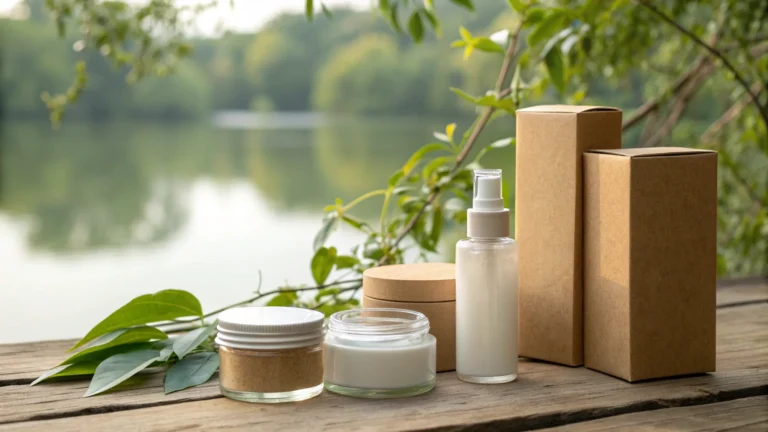
Step 6 – How can you do sustainability10 without overpromising?
Do you want to be an eco-friendly brand but don't know where to start? Be careful. Greenwashing, or making misleading claims, can damage your brand's credibility more than doing nothing at all.
Focus on practical, verifiable sustainability10. Use materials with Post-Consumer Recycled (PCR) content, design for recyclability by using mono-materials, reduce overall packaging weight, and be transparent with your customers about your choices. Honesty is better than perfection.

Everyone wants to be sustainable, but the term is often misused. From a supply chain view, true sustainability10 is about making measurable improvements. The best first step is using PCR content—for example, a PET bottle made from 30% recycled plastic. This uses less virgin material. The next step is designing for recyclability. A bottle and cap made from the same material (mono-material) are much easier to recycle than a component with mixed materials, metal springs, and glue. Another easy win is "lightweighting"—making your packaging slightly thinner to use less material and reduce shipping emissions. I always tell my clients to avoid vague terms like "eco-friendly" or "earth-conscious." Instead, be specific. Say "This bottle is made from 50% PCR plastic and is 100% recyclable." It's clear, honest, and builds more trust than empty buzzwords.
Practical Sustainability Actions
- Use PCR Content: Incorporate recycled plastic (rPET, rPP) into your components.
- Choose Mono-Materials: Use the same type of plastic for the bottle, cap, and pump where possible.
- Offer Refills: Design a durable primary container and sell product refills in simpler, lighter packaging.
- Reduce Weight: Work with your engineer to reduce the material used without sacrificing durability.
- Be Transparent: Clearly state what is recyclable and how to do it. Admit where you are still working to improve.
Step 7 – Why are sampling, testing & mass production so important?
Your design is approved and you love the 3D render. Are you ready to order 100,000 units? Stop. Hidden flaws that you can't see on a screen can turn into a massive, costly failure.
Sampling and testing are mandatory steps. You must get physical samples to test compatibility with your formula, perform shipping tests to check for leaks and breakage, and confirm that the final colors and decorations match your standards. Only then should you approve mass production.

This is where the rubber meets the road. In my experience, most major packaging disasters happen because this step was rushed or skipped. A 3D render can't tell you if the cap will screw on tightly. A color on a screen will never perfectly match a physical plastic color. You need to get pre-production samples in your hands. First, you fill them with your actual product and let them sit for weeks to check for any leaking, discoloration, or warping (compatibility testing). Then, you put them in a box and ship them around to simulate real-world transit (shipping test). I once saved a client from disaster when we discovered during a shipping test that the pump tops were popping open under pressure. Imagine if they had shipped 50,000 units to a retailer like that. Approving mass production is a big commitment of time and money. You must be 100% confident that what the factory is about to produce is exactly what you need.
The Testing Checklist:
- Fit & Function: Does the cap seal perfectly? Does the pump dispense correctly?
- Aesthetics: Do the color, finish, and printing match the approved standard?
- Compatibility Test: Does the product react with the packaging over time?
- Shipping Test: Does it survive being dropped, shaken, and exposed to pressure changes?
- Line Trial: Can the factory fill and assemble the packaging efficiently?
What are common mistakes to avoid in cosmetic packaging?
Think you've covered all your bases and are ready to launch? Simple oversights can still derail your project, costing you thousands of dollars and months of delays. Let's learn from others' mistakes.
The most common mistakes are designing in isolation without factory input, ignoring product compatibility testing, underestimating manufacturing lead times, and prioritizing complex aesthetics over practicality and budget. Avoiding these pitfalls requires collaboration and a dose of realism from the start.

I've seen these same mistakes happen over and over. A brand falls in love with a design and spends a fortune on it, only to find out it will cost $3 per unit to produce for a product that retails at $20. That's a failed business model. Another common one is ignoring lead times. Custom packaging doesn't appear in two weeks. Tooling for a custom mold can take 8-12 weeks, and production can take another 4-8 weeks. If you don't plan for this, you'll miss your launch date. The biggest mistake, underpinning all of this, is a lack of collaboration. The brand, the designer, and the manufacturer must work as a team. When the designer's vision is checked against the manufacturer's capabilities and the brand's budget early and often, you avoid almost all of these common, painful, and expensive errors.
| Common Mistake | The Painful Consequence | How to Avoid It |
|---|---|---|
| Designing in a Vacuum | The design is too expensive or impossible to produce. | Involve your manufacturer during the design phase. |
| Skipping Compatibility Tests | Product leaks, packaging warps, formula degrades. | Always test your final formula in the final packaging. |
| Ignoring Lead Times | You miss your retail launch date and lose sales. | Ask for a realistic timeline upfront and plan for delays. |
| Overly Complex Design | High defect rates, high assembly costs, poor user experience. | Prioritize function and manufacturability. |
Conclusion
Effective cosmetic packaging is a careful balance of brand identity, user function, and manufacturing reality. By following these steps and collaborating with your partners, you create packaging that succeeds in the real world.
Explore effective strategies for creating cosmetic packaging that stands out and performs well. ↩
Learn about the essential technical requirements that ensure your packaging protects and preserves your product. ↩
Discover the best materials and structures that balance aesthetics, functionality, and cost. ↩
Understanding manufacturability can help you avoid costly mistakes in your packaging design. ↩
Understanding the supply chain implications of packaging can help you make better design choices. ↩
Discover how packaging can effectively convey your brand's story and values to consumers. ↩
Understanding labeling requirements is essential to ensure compliance and avoid costly mistakes. ↩
Explore the various types of packaging available and their suitability for different cosmetic products. ↩
Explore how thoughtful packaging design enhances the overall user experience with your product. ↩
Discover practical sustainability measures that can enhance your brand's credibility and appeal. ↩
Understanding your brand identity is crucial for creating packaging that resonates with your target audience. ↩